HEROES WANTED: A FANTASY ANTHOLOGY (Cover Reveal and Release Announcement by Shane Cook)
When I was approached by Laura Hughes to draw the cover for Heroes Wanted, I jumped at the opportunity. As much as I’ve wanted to, I’d never had the chance to work on a book cover before, so I was over the moon.
After seeing the previous cover for the Lost Lore anthology by Andreas Zafiratos, who had set an incredibly high standard, I was a little nervous about how the work I had done previously would translate in this new field; but working with Laura and the team, my nervousness quickly turned to excitement.
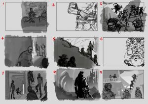
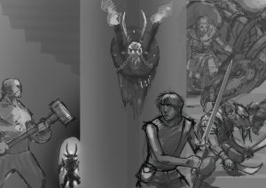
What I tried to focus on in the initial sketch page was to have something dramatic, atmospheric and commercially eye-catching. To that end, I was experimenting with different compositions and ideas. One of the elements that I was hyper aware of was that as an anthology there would have to be more than one character, race, or even genre that I might have to add to the picture, so (as you can see above) I covered the page with idea diarrhoea to see what the general consensus would be on what looks good.
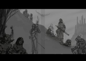
I really wanted to understand the mechanics of composition and how it can be used to attract someone from a couple of foot away so I studied the composition of some classics and after some input from the authors we narrowed the idea down to these images, each with their pros and cons:
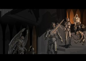
With the composition chosen, it was time to populate the image with characters from the various stories. I used a spreadsheet that the authors had kindly provided detailing some characters, backgrounds and appearances, so I was able to get a general idea for the characters before reading up on them and hopefully nailing their characteristics.
As this was my first time drawing a book cover, I really didn’t want to fall into the trap of placing important elements where I knew text would be. I still wanted the image to work without it, but we thought it would be best to try a couple of text versions just to get a general idea of how the space might be used and what is “prime real-estate” for the juicy details.
With all the sketching, planning, notes, ideas and the go-ahead from the team, I got cracking. The process was a back and forth of trial and error, rendering, testing out an idea, rendering, looking at the picture from 5 feet away, on a big TV screen, flipping it horizontally back and forth, then more rendering, rinse, repeat.
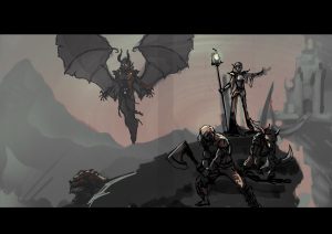
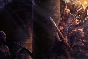
Some of the things I kept in mind were to have some diagonals splitting the image, avoiding tangents as much as possible and using lighting and brightness to lead the eye to focal points in the image. Above all, though, I wanted to produce something that the authors would be pleased with. After my favourite part – adding all the FX – I sent along the final image:
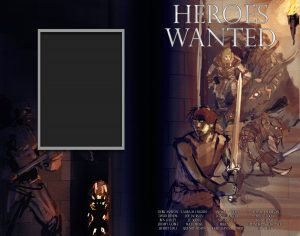
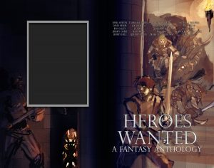
And DONE! My small role in the creation of this incredible piece of work “Heroes Wanted” was over and left in the capable hands of designer Christian Bentulan, who added the typography and final touches:
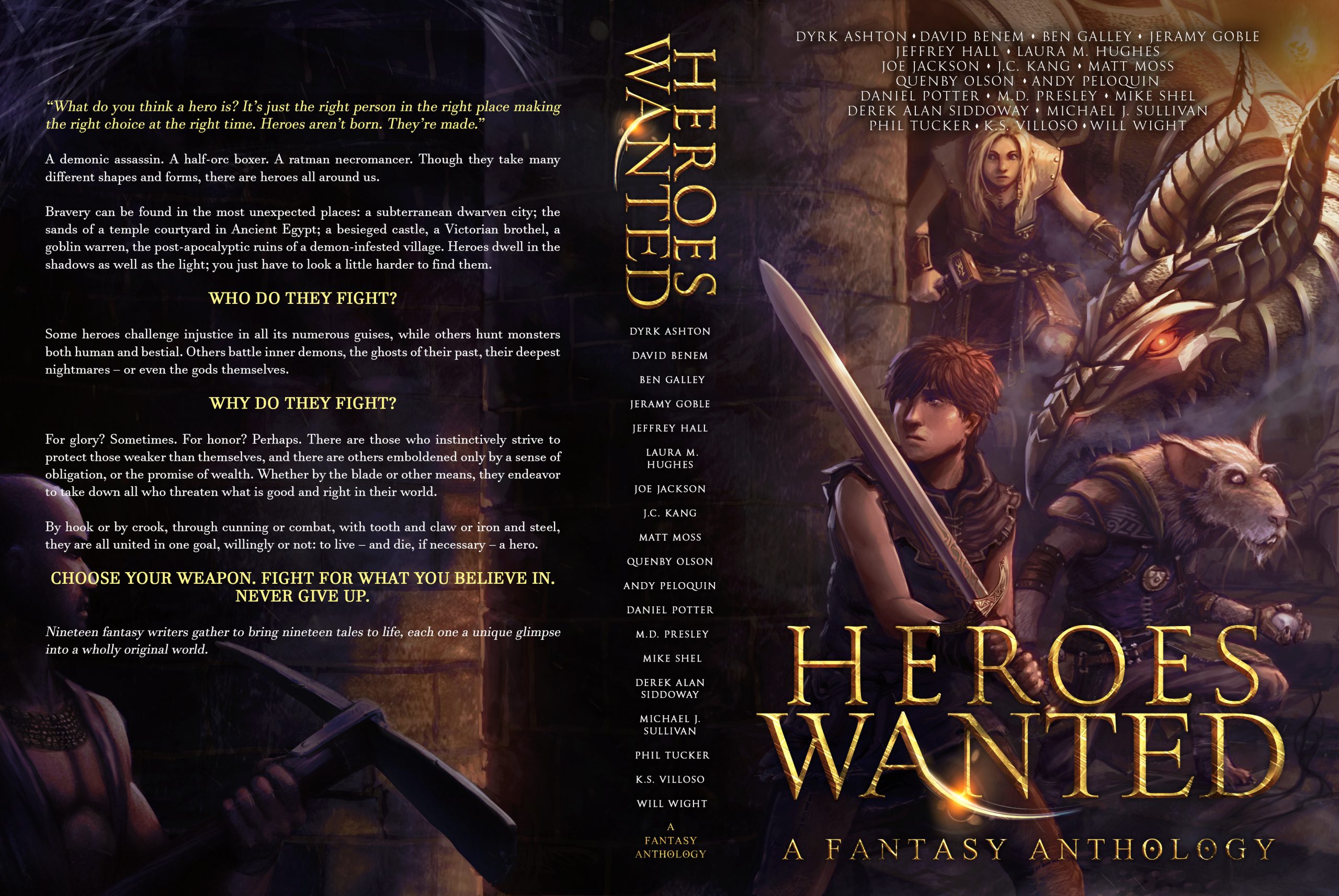
Click to view full-sized image (opens in a new tab)
EXCELSIOR!
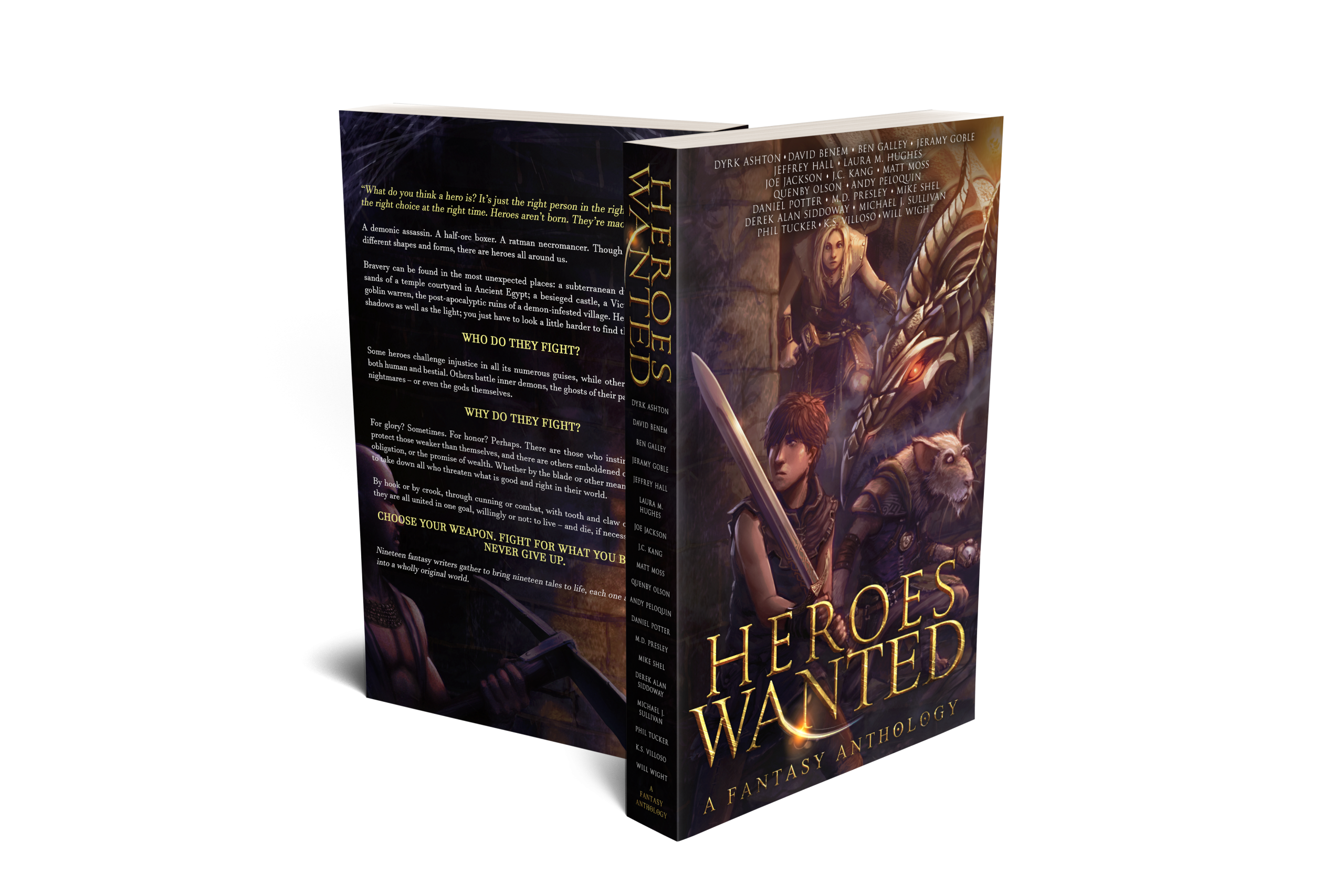
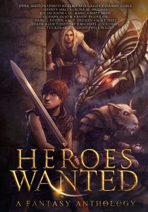
HEROES WANTED is available in ebook (FREE!) and paperback now.
Shane Cook is a freelance illustrator based in the south of Wales. He has a diploma in Illustration and a degree in Computer Game Design, and has been drawing professionally for around a decade. A lifelong love of fantasy novels and comics means the likes of Frank Frazetta, Greg Capullo and David Gemmell are always present to some level in his work.
When he isn’t working, Shane spends his time either practicing drawing techniques, learning more about the programs he uses, or building up his portfolio. If he had to classify his art, he’d describe it as something along the lines of dystopic, gore-fi, fantasy-horror-esque comic-y illustration (so it’s a good thing he tries to steer clear of classification).
Shane is dedicated to keeping the artistic process as light and fun as possible for everyone involved, and welcomes any and all criticism since it helps make him a better artist. You can find him on Artstation as Shane Cook, and on Instagram at https://www.instagram.com/shanecookart.
[…] cover art was done by the epically talented Shane Cook, and the typography by master of design Christian Bentulan. (If you’ve read my entry in the […]
Great job, Shane! I’m honored to have one of my Royce and Hadrian Riyria stories nestled between your amazing design work.
Thanks so much, it was my pleasure, honestly.